
What do you envision from the word dripe? I think of boiling cowhides as feedstock for collagen peptides in the manufacture of gelatins used for deserts or your favorite mascara or lipstick. I was close on both counts. The word is tripe (not dripe), which is cow stomach, rather than cowhide. The holidays are on the doorstep, and you need appetizers, right? You’re welcome. Visit your local butcher, get some tripe, and get cookin’!
DRIPE, the acronym, is demand reduction induced price effects. Do ya think somebody was trying to create a catchy acronym? Result: cow stomach.
This post introduces DRIPE concepts and takes a peek at demand management’s impact on energy prices.
Conventional DSM Cost Effectiveness
Our demand-side management (DSM) industry has the standard 3-5 cost-effectiveness tests. For a primer, see A Handful of Excedrin, which I frequently use as a quick reference. In the discussion below, “pass” means benefits are greater than costs.
- The participant test almost always passes because the customer gets all the benefits with the help of their friends – the non-participants.
- The total resource cost (TRC) and its flamboyant cousin, the societal cost test (SCT) and versions thereof, are status quo for determining whether programs, portfolios, and sometimes individual projects are cost-effective.
- The program administrator cost test (PACT) almost always passes because efficiency is cheaper than generation.
- Finally, we have the dreaded ratepayer impact measure (RIM) test, which never passes for efficiency programs because utilities are in business to make profits.
I wrote the RIM test fails because the average avoided cost (benefit) to supply electricity is always less than the utility’s average lost revenue (cost). Otherwise, utilities would lose money and go out of business. Therefore, the RIM test as a pass/fail for efficiency programs is twisted, backward, and upside down. The RIM test is also dumb because it’s myopic, not accounting for broader impacts or utility and customer shared cost savings years into the future.
Avoided Cost Misinterpreted?
I understand the mechanics of benefit-cost tests slightly better than I understand dentistry. However, when I hear things like, gee, our avoided costs are plummeting because all the renewable energy supply coming online has no incremental avoided cost, I think there may be something seriously wrong with the algorithms. Renewable electricity is never the marginal market-clearing supply. Look at the following typical “generation stack” chart that the independent system operators or regional transmission organizations (synonymous) have at their disposal.
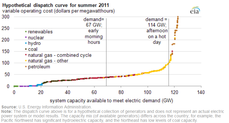
This chart is from 2011, but the curve is fine for this discussion because it would look about the same today. Only the legend and generation mix would differ.
Among other things, the RTOs manage reverse auctions for power on a day-ahead basis. A reverse auction simply means the cheap stuff is purchased and consumed first. That is the renewables, with zero incremental cost on a day-ahead basis. That’s the yellow highlighted part of the curve.
This point is critical – the supply curve shifts by the day and time of day. All the solar generation goes to zero at night. So if the yellow part is all solar, move the entire curve to the left by about 20 gigawatts. Similarly, wind generation has the curve gyrating left and right from day to day and hour to hour.
The second critical point is efficiency, demand response, and grid-interactive buildings save energy at the margins – the last kW/kWh the RTOs buy. These purchases and avoided costs for efficiency and demand response are out on the right. The lavender-highlighted part might be where efficiency and grid-interactive efficient buildings allow RTOs to avoid purchases. The magenta part might be where demand response allows RTOs to avoid purchases.
So why does demand response enjoy the benefits of marginal demand/energy savings while efficiency has people thinking, gee, our avoided costs are so low that we can’t get efficiency to pass the [decrepit] cost-effectiveness algorithms? The marginal fuels are still natural gas, coal, or fuel oil. No change since the time of this outdated chart, so why the angst?
DRIPE
Demand-reduction induced price effects, DRIPE, not cow stomach, represents demand curve movement induced by long-term, big-picture effects of demand management and efficiency and the associated benefits for all energy users. My discussion with Doug Scott regarding performance-based rate-making touched on this impact even though we didn’t mean to, nor did we identify it as DRIPE.
The cartoon below illustrates nominal supply with my guess for the price elasticity of demand[1] for electricity during three scenarios. The demand curve shifts with weather and time of day. Price elasticity is probably more pronounced at higher prices (less vertical and more elastic). My guess is when the price is low, it has less effect on consumption (more vertical and less elastic).
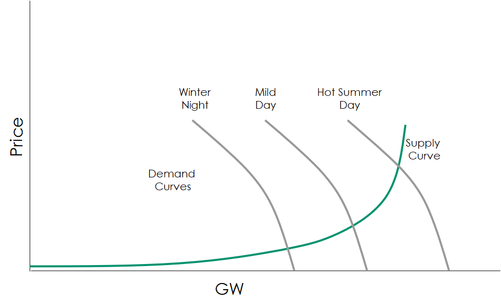
These demand curves are for illustrative purposes only. Demand curves may be as shown if prices paid by customers changed for energy in 15-minute increments. This would be analogous to paying for the highest demand in a 15-minute window. Demand charges wouldn’t be needed if customers paid actual prices over the same increment.
As shown the demand curves move with the time of day (and day type, for that matter – weekend or weekday), and weather conditions. Efficiency and demand management will also move the demand curve (DRIPE).
Here ends the introductory appetizer. Next week we will cover DRIPE in the big picture.
[1] The price of elasticity of demand represents how the demand for an item changes in response to a change in price.