When I dig in to research a topic for the Rant, it’s a bit like American Pickers with Mike and Frank, but not drama. Pickers cover thousands of square feet of junk or treasure. I suppose the contents of this blog could be described as thousands of words of junk or treasure. This week we “pick” the last bits from the research that came from the paper, Climatic Impacts of Wind Power[1].

This week we examine data representing the Midcontinent Independent System Operator’s (MISO) load and wind supply curves.
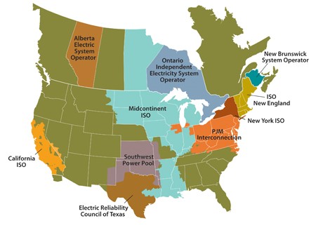
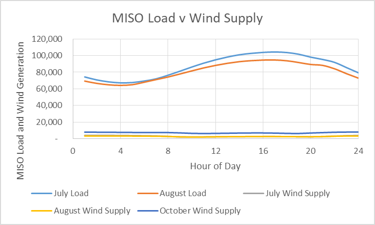
First, the MISO territory is enormous, stretching from the Gulf of Mexico almost to the Arctic Circle. It contains maybe half the prime real estate for wind generation in the North Central tier of states including Iowa, Minnesota and the Dakotas. here is nothing there to stop the wind. Believe me. As I returned to my Alma Mater, South Dakota State University in Brookings, a couple of years ago, I realized that I could see the curvature of the earth out there. This first plot shows average hourly loads for MISO, by month. The blue curve towering on top represents July. The brown line just below it, August.
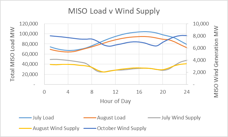
The second plot shows hourly loads by month for July and August, plus wind generation in the same months. I added October to demonstrate the difference in wind output when it is needed much less compared to when it is needed much more in July and August. NOTE: the wind numbers are represented on the right axis to more clearly show this timing effects.
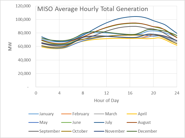
I reported that wind generation craters in August when we have the highest loads in the Midcontinent. That was demonstrated with a curve that shows total generation by month. Looking a little deeper, since I collected a lot of junk for this series of posts, we see that it not only bombs for the month, it bombs the rubble for time-of-day generation as well. During peak load periods, wind delivers the least power, on average, for the entire year.
The next plot puts the wind and load on the same axis.
Coincidence Factors and Need
In the efficiency world, we live by goofy things called benefit/cost ratios and coincident peak demand. According to the almighty Uniform Methods Project, coincidence factor “is the ratio of the population’s demand at the time of the system peak to its non-coincident peak demand.” For a supply-side resource, simply replace the word “demand” with the word “supply” in the UMP definition, and we have what we could call the supply-side coincidence factor. UMP definition, and we have what we could call the supply-side coincidence factor.
The higher the peak coincidence factor for an energy-saving measure (lighting replacement, etc.) the better. Why? Because it knocks down peak demand, which has a big impact on avoided cost. Reducing peak demand reduces the need for generating, transmission, and distribution equipment, and their associated costs.
A good coincidence factor for an efficiency measure might be 70% or higher. An example of a measure with poor coincidence factors is parking-lot lighting. The lights are used completely outside of peak hours, which as you can see above, is July, between 3:00 and 7:00 PM. There’s a reason fireworks start at 10:00 PM in July.
What is the equivalent coincidence factor for wind?

That is, the average power produced at 5:00 PM in July divided by the peak wind production for the year. Incidentally and quite amazingly, if I take the average wind generation and divide by an assumed capacity factor (average kW divided by nameplate kW) of 40%, I get the same number to three digits. That is amazing to me.
Generating Cost Comparison
Finally, let’s compare the levelized cost of electricity production, including first cost, fuel cost, fixed operations and maintenance (O&M), and added transmission cost. I produced the next chart with data from the Institute for Energy Research. I am not sure what their agenda is, but their data for wind and combined cycle electricity costs are very close to what the Energy Information Administration posts.
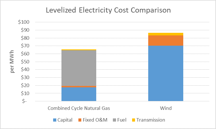
The fuel cost shown is quite high for natural gas. Per my calculations, $5 natural gas at 60% efficiency for mediocre combined cycle plant efficiency is only about $28 per MWh, compared to the $45 shown. My costs are representative of those today. The current cost of all future fuel costs is heavily dependent on guesses for future prices and an assumed discount rate. I guess this answers my question, from August, is wind plus transmission cheaper than fuel?
The capital cost for wind is 4.1 times the capital cost for natural gas on a kWh (energy) basis. For a coincidence or dispatchability factor of 100% for natural gas and 18.5% for wind, the capacity cost for wind meeting peak load is 8.5 times the cost for natural gas meeting peak load.
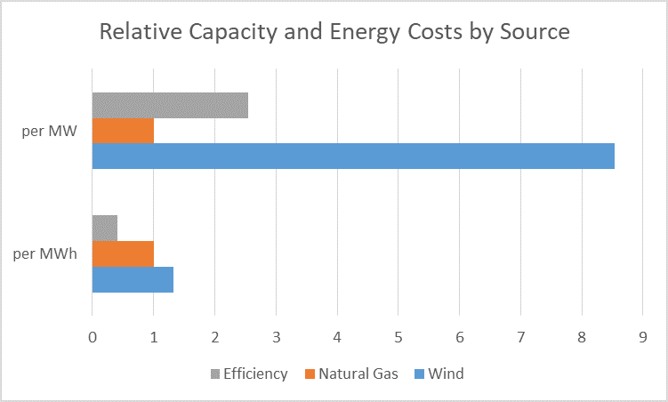
Let’s roll all this together in one easy cost comparison for energy (kWh) and capacity to meet loads during peak periods of 5:00 PM in the July MISO region. The combined cycle natural gas plant is the basis for comparison for capacity (MW) and energy (MWh).
The efficiency data shown come from Lazard for energy cost. For capacity cost, I used a coincidence factor of 0.7 and an average useful life of 13 years per Lawrence Berkeley National Lab.
Why are wind farms so prolific?
[1] Miller and Keith, Climatic Impacts of Wind Power, Joule (2018), https://doi.org/10.1016/j.joule.2018.09.009