The super heatwave of a couple of weeks ago in the northwest got me thinking about weather anomalies and climate change. What is really happening, as if anyone knows. This fits nicely with a paper that was published a month ago by the Institute for Energy Research entitled Climate Policy – The Case for a New Perspective. That provided some interesting data and got me going on more in-depth research. I added to that through a few hours of mining National Oceanic and Atmospheric Administration (NOAA) data. Whoa, does NOAA have data! Yeow! So let’s look at the data and then review IER’s perspective[1].
It was a long weekend allowing for massive data collection. So beware!
Temperature
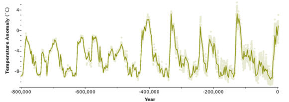
The first chart below is from the IER paper, source Heritage Foundation. As a check, I found the second chart by NASA, which shows approximately the same data. The punchline: earth’s temperature fluctuates A LOT: about 8 degrees C. The current effort is to limit the temperature rise by about 2C. Why 2C? Maybe because that appears to be the hottest the planet has ever experienced, and if we can keep it below that, it won’t blow up.
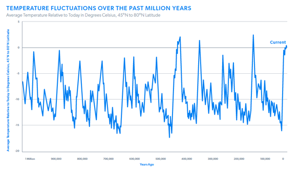
 These wild temperature fluctuations are in the absence of man and the industrial revolution of the last century. Months back, I watched a video that demonstrated how to trigger people and deceive them. Simply pick the “right” start date to show the catastrophic trend desired. In this case, ignore everything before, oh, the last few thousand years.
Temperature and CO2
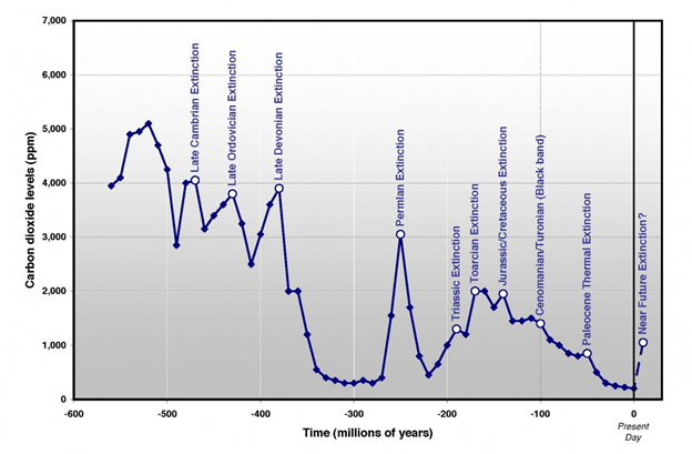
Still more interestingly, I found this plot published in a Researchgate paper. Millions of years ago, CO2 levels were over 10x higher than today at a measly 400 parts per million. In the dinosaur days, CO2 levels were 3x-6x of today. And look at how hot it was: 10C hotter than now.
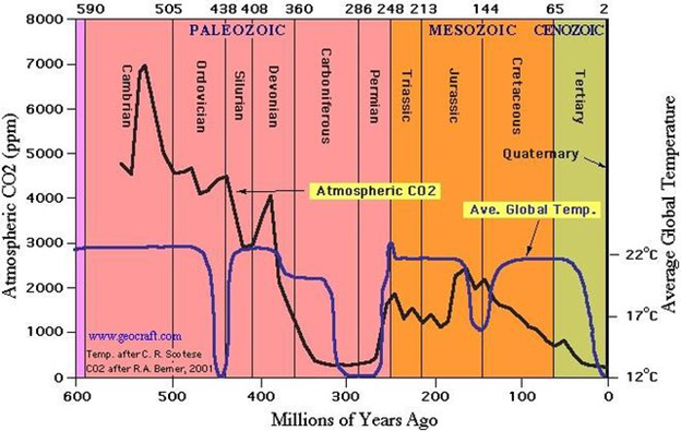 Again, since everyone has an agenda or at least some bias, I wanted to verify the above data. Per the following chart posted by an “oceanographer, consultant and leading expert on sea-level rise,” the above chart is pretty doggone accurate.
 One argument I found is that temperature drives CO2 levels and not the other way. That theory is that as oceans warm, they give up CO2. When they cool, they absorb it. However, the hole in that theory is that O2 levels are declining as CO2 levels rise in the last century. I wondered if CO2 is rising because of fossil fuel burning, O2 levels must be on the decline, and it is. The fact remains that historically, CO2 levels are just above the all-time nadir.
Weather Since the Start of the Industrial Revolution
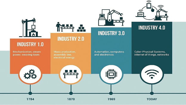
Let’s move back, or forward I guess, to the last century. We are in the fourth industrial revolution. The second revolution included the widespread burning of hydrocarbons for motive power.
 NOAA has data going back to about 1895, but if you know Excel, day one is 1/1/1900, and you have to practically be a coder to get Excel to do dates before that, so to hell with those five years. We’re starting at 1900!
Temperature
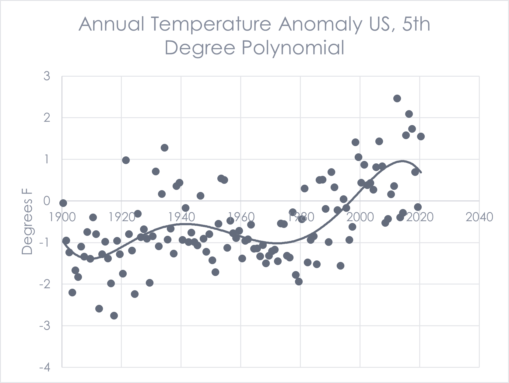
First off, temperature. The climate over the US at least has warmed over the past century. I confirmed that over five years ago in Climate Change 1, Things Untold. Today’s data are taken from NOAA, showing the annual temperature anomaly for the contiguous United States. What is the trend? Well, we can see that temperatures are on the rise and the nerd in me wants to slap a curve fit on it. Here I demonstrate the power of lying statistics. In the first plot, I use a 4th-degree polynomial to fit the data. OMG, we’re going to burn alive!
But wait a minute. Between the 1960s and 1970s, we had a mini cooling period. Any wonder why in the early 1970s, we were at the doorstep of the next ice age and widespread famine? Apparently, our ha school baseball cliche “you’re only as good as your last at-bat” applies to climate science too. So, I want to see that dip in the 1970s on my curve fit. Add another degree of freedom on the polynomial curve fit, and we see in the following plot that the same data show we’ve rounded the corner and temperatures are headed back down. This is a great illustration of data presentation to tell the story desired.

 Precipitation Anomalies
 Precipitation Anomalies
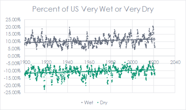
Next, I looked at the portion of the country that has been abnormally wet or abnormally dry for the same 120 years, for every month of the year. I used a 12-month sliding average and plotted it below. We can see that as the air gets warmer, we get more rain and less drought. If I didn’t have a day job, I might examine the temperature vs rainfall correlation.
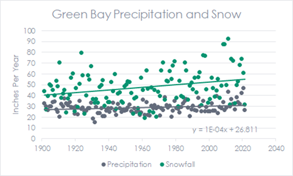
 Next, I wanted to see how snowfall trended over time. Since snowfall is not a national thing, I grabbed one city in the Midwest with a long history covering Green Bay. Interestingly, annual precipitation didn’t budge – like 0.01 inches per year. However, snowfall increased by almost 15 inches (July 1 to the following July 1)! Warmer winters mean more snow, at least here in the Midwest. We don’t get the massive dumps of snow when it’s below 10F.
Snow and Sea Ice Anomalies
 Snow and Sea Ice Anomalies
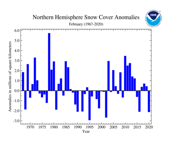
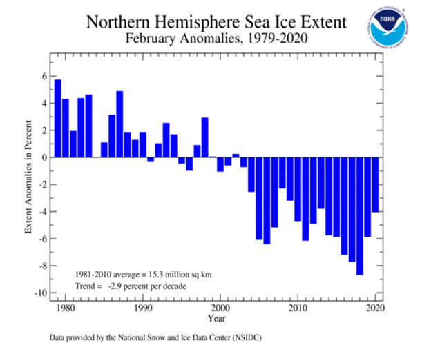
I later found the following snow-cover anomaly chart for the entire northern hemisphere for the last 50-plus years via NOAA. I chose February. I include sea ice in the northern and southern hemispheres for the same period. Interestingly, the snow cover and southern hemisphere sea ice follow random gyrations, but the northern hemisphere ice cover does not. It is worth noting that these are anomalies, and they do not accumulate. So all of a sudden, boom, the sea ice may shoot back to normal in a year or two, or not.
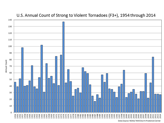
Tornadoes
 Tornadoes
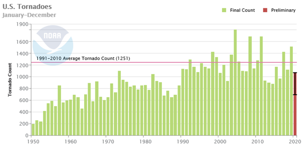
What about storms? Let’s start with tornadoes, which have increased over the last 70 years, per NOAA. But, I learned this first chart includes EF-0, as in zero-power storms[2]. Looking at EF-1 and up, there is no increase. Looking at strong storms, they are decreasing in number.

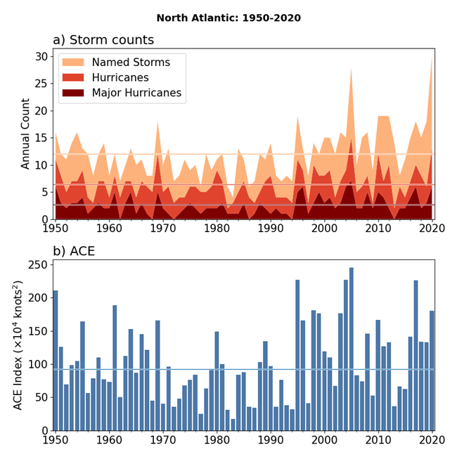
Tropical Storms
 Tropical Storms
Here are seventy years of North Atlantic hurricane data. ACE is the accumulated cyclone energy, which means duration, strength, and the number of all tropical storms rolled up to one number. The data are again from NOAA.
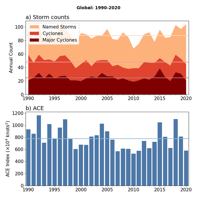
 Globally, there are fewer years of data shown below. Global data are also less choppy, as one might imagine. When anything is aggregated, anomalies are less pronounced.
Summary
 Summary
- CO2 levels and temperatures have gyrated wildly over millions of years; CO2 by more than 10x of today; temperatures in a range of about 10C.
- Temperatures have warmed by a couple of degrees in the last century.
- Warmer temperatures have brought more rain, less drought, and more snow in the Midwest!
- Snow cover has fluctuated randomly for the last ~50 years.
- Sea ice at the poles has been on the decline but appears to be recovering a little.
- North American tornado activity has been flat, while the strongest storms have been on the decline.
- North Atlantic tropical storm activity has increased along with total energy released. Global tropical storm intensity is roughly flat for the last 30 years.
- Wildfires are not included because that is a function of fuel management.
- Property damage not included because of fire (see previous) and development in areas prone to tropical storms and associated flooding – human choice, in other words.
- IER analysis is coming next week.
- Data are easy to manipulate to fit any narrative by picking start and end dates or even curve fitting.
[1] IER generally favors conventional sources of energy over renewables and alternative forms of energy and storage for their material intensity, intermittency, land requirements, waste, etc.
[2] Minor exaggeration alert.