
Last week, I was commenting on some retro-commissioning findings, and I was considering demand savings estimates versus energy savings estimates. A colleague asked, “If you are aware of any energy versus demand papers I would like to know more.” I was informed that the Association of Energy Engineers coursework for becoming a Certified Energy Manager only skims the surface, using a garden hose as a metaphor, for demand and energy. The flow of water represents the flow of power (kilowatts), and the water represents energy – the sum of power over time. This is a disservice because demand charges can be half or more of a customer’s energy bill.
A more direct example using water is a hydroelectric dam, like New York’s Robert Moses facility. Energy, in the form of water held at high elevation, is converted to electricity with the flow of water through any of its 13 turbines. These turbines, unlike steam turbines, are essentially pumps that work in reverse. Rather than using electricity to produce pressure and flow as a pump does, a turbine uses pressure and flow to produce electricity.

As we engineering nerds should know, all of our energy, except nuclear, comes from or came from the sun as follows:
- The sun can produce power directly with photovoltaic.
- As the earth spins and orbits the sun, seasons change and temperature differences result. Temperature differences are the drivers of weather and wind to produce wind power.
- As the sun evaporates moisture, lifting it high in the sky, the moisture ultimately falls out in the form of rain and snow. On its way to the sea in liquid form, we have hydroelectric power plants.
- Lastly, we have organic matter consisting of Cs and Hs (carbon and hydrogen compounds) that can be burned to produce steam to generate electricity. Natural gas, coal, and biomass are examples. Production of organic matter is ultimately powered by the sun.
Dazzle your kids, parents, and coworkers. When things get a little slow at the wedding party or picnic, you can always pull out this card to jazz up the crowd.
A Calculus Lesson
If you think the above facts will fascinate your family, friends, and acquaintances, you will be able to tell them you learned calculus today, too.
I guesstimated power consumption by major end use for a residence on a warm day where substantial air conditioning is used. This particular home has an electric water heater. My guesstimated 15 minute power draw for each end-use is shown in the x-y plot below. Every marker represents a full 15 minutes in this case.
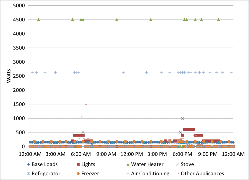
Although I generated the data in the chart myself, it is quite realistic for a single family home on a warm Midwest day. The energy shown, times 30 days, comes to 1200 kWh. And since some people just don’t feel fulfilled without a pizza chart, that is provided too. Go ahead; find your own pizza chart, but keep in mind, this chart is for one warm day, not an entire year.

Power and Energy
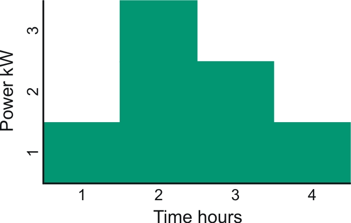
Energy is power integrated over time. This is where the calculus comes in, if you want to call it that, just for fun. One majorly awesome element of calculus is it is used to determine the area under a defined curve. In the case of electrical energy, the area under the curve is time × power, or hours × kW. Actually, it can be any amount of time (minutes, seconds) multiplied by any unit of power (Watts, foot pounds, Newton meters, ergs). It would then be converted with simple mathematic relations to the standard unit of sale, the kWh. Consider the power-time chart below. We can see the maximum demand over this period is three kW. Each block is a kWh = one kW for one hour. There are seven kWh represented in this simple chart.
Power and energy, over time for real buildings, can be represented by zillions of these blocks.
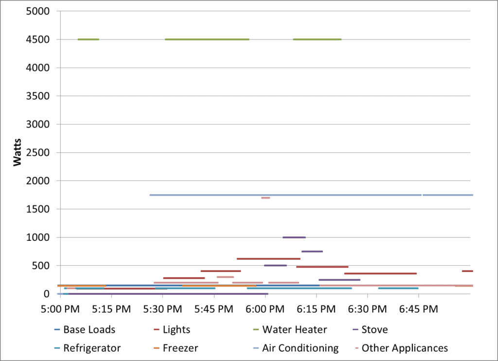
Going back to my house data, I zoomed in to the hours of 5:00 to 7:00 PM, the time when my occupants of this house come home and start doing the usual evening activities. The loads are shown in the next chart. In this case, I’ve broken time down into 30 second increments and power is in Watts.
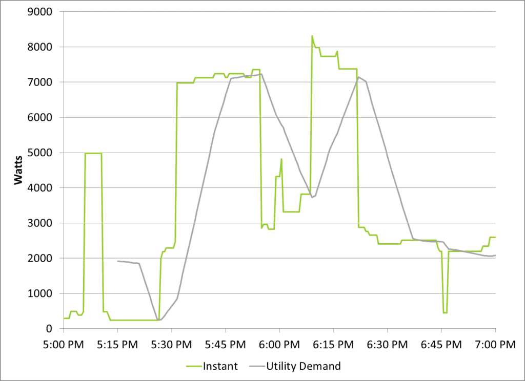
To get from here to the bill, the total load is metered at the home level. Home-meter data are shown in the next chart, which shows instantaneous demand and utility billed demand. Hardly any utilities bill residential customers with demand and energy charges, but it’s coming and I wrote about it back in Renewable Energy Pricing.
Many/most commercial and industrial customers are billed for demand plus energy. Utility billed demand is usually the highest 15 minute sliding average demand. In the case of the home example in this post, the instantaneous peak (green) spikes to just over 8000 Watts, or 8 kW; over half of which is due to the electric water heater. If this customer were billed for demand (gray), on this day, the peak is just over 7 kW.
Home-Meter Data
Energy, or kWh, is represented by the area (recall the 7 kWh example above) under the kW curve. This is shown below. Just take the chart above and fill it in with a crayon. For this two-hour period the consumption (area under the green curve) is 7.4 kWh.
More, later.

Energy, or kWh