
Show me the money, Jerry! That is what I have to say about building energy performance. I don’t care for bling and doohickeys. What is the bottom line at the meter?
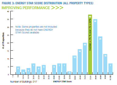
I surmise that ENERGY STAR Portfolio Manager[1] was conceived and developed with the best of intentions to score and rank buildings, at the meter level, for energy performance considering vast factors including building type, hours of use, climate zone and so on. However, as noted in the Lake Wobegon post a few years ago, not all, but most buildings are above average [sic]. In that case, the average building benchmarked in Chicago, circa 2014, qualified for ENERGY STAR. The distribution is repeated nearby.
My assessment was corroborated with an ACEEE paper by another author, smarter than I, that year.
My message was that EPA needed to go back to the black box and see inside. They needed to modify their algorithms or try some new chicken bones.
Updated Portfolio Manager Rolled Out
And so, they have, and people don’t like it. The EPA incorporated the most recent commercial building energy consumption survey (CBECS) data into the model. That represents a perfect time to fix the engine because they can blame falling scores on new buildings added to the mix.
I have not dug into the grit and data, but I can tell you EPA is far more transparent and open with the recently released model. They discuss source and site energy use intensity, which is simply annual energy use per square foot of conditioned (occupied) floor space.
Site and Source Energy
Site energy intensity is determined by converting all metered site energy to the British Thermal Unit, which is the energy required to heat a pint of Guinness one degree Fahrenheit[2]. Site energy intensity is an exceedingly poor measure because not all Btu are of the same value. For illustration, see the chart to the right which I just presented for the Utility Basics course for the Wisconsin Public Utilities Institute:
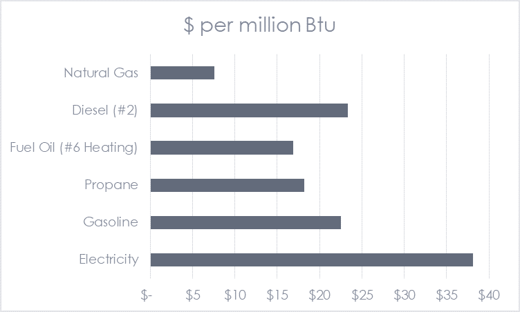
A far more useful metric is source energy, also known as primary energy. Using source energy more closely aligns with a ranking of buildings in dollars per square foot. It is also more representative of a building’s environmental footprint. As shown in the chart above, electricity is worth much more than other fuel sources and therefore, its source Btu content aligns with the thermal energy required to generate it – and that is 3-4 times site energy, aligning with its higher cost.
Scores Mean Percentile
Before the recent release, the EPA seemed evasive in its description of what scores represented. No longer. They make it very clear; the scores represent percentiles in energy intensity ranking, and that is the way it should be. See Lake Wobegon for further discussion.
Summarizing, EPA is clear on what the scores mean, what energy is used in the benchmarking and ranking, and at least for the description, they are clear on how the sausage is made. Now users don’t like it.
Complaints Roll
The EPA has a bit of a mess on its hands. I believe they fixed their model while updating the data as described above. The problem is past ENERGY STAR award winners are now seeing their buildings being kicked out of Lake Wobegon[3].
The Wall Street Journal, the instigator of this edition of the Rant, reports that “While the program isn’t mandatory, many landlords agree to participate because tenants increasingly seek more energy-efficient buildings. Some will only sign leases in buildings certified by the EPA as Energy Star, for top performance. Property investors also pay close attention because about 20% of a typical office building’s costs go to lighting, heating and cooling.”
Wow! That is fantastic!
Let us grab a few more gems from the article.
Benchmarking is Not Easy
“Surveying commercial buildings is tricky,” said Carl Blumstein, director of the California Institute for Energy and Environment. Yes indeed. See Benchmarking Clowns. Benchmarking is a tedious venture, often requiring site visits to commercial and industrial buildings, merely to get the energy consumption right – so the energy use reflects the conditioned space represented!
Lighting and Regional Factors Shift Intensities
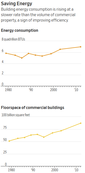
As the graphic from the article posted next door shows, efficiency in buildings is improving – from 91 quads per million square feet to 80 quads/million square feet. However, do not confuse this with new buildings being more efficient. Most of this is due to retrofits of lighting. I wrote about this and why new buildings suck in New Construction Program Failures a couple of years ago. Moreover, on a national basis, the south is building and adding space the fastest. This is represented in cooling consumption increasing and heating consumption decreasing substantially on a national level. Electric Power Research Institute notes this southern sojourn in their 2018 National Electrification Assessment report.
Owner Effort is Now Required – Great!
The article states, “Many landlords expected some decline in ratings because thousands of new buildings have joined the Energy Star program…” The EPA makes it clear that the ENERGY STAR sore is not based [their emphasis] on information from other buildings entered into Portfolio Manager.
It continues, “…materials, designs and technology have improved energy efficiency, making it harder for buildings that haven’t upgraded to maintain high scores.” Shyeah! Buildings have been graded against the pre-iPhone era, which predated the LED era.
Time to update. Time to get fit!
[1] An online graphical interface used for data entry and ENERGY STAR scoring.
[2] Close enough.
[3] Lake Wobegon is the fictitious town where per Garrison Keillor, “women are strong, men are good looking, and all children are above average”. Previously, all (almost) buildings were above average per ENERGY STAR Portfolio Manager.