For 50 years ending in 2000, electrical loads in the United States expanded at an average of 5.1% per year. For the next 20 years, the growth was essentially zero. Projections for the coming five years are roughly 1% per year (compounded annual growth rate, CAGR). Although that is far from 5% CAGR, it is more than zero, and considering construction of everything from generation to transmission lines is on the decline, something must give.
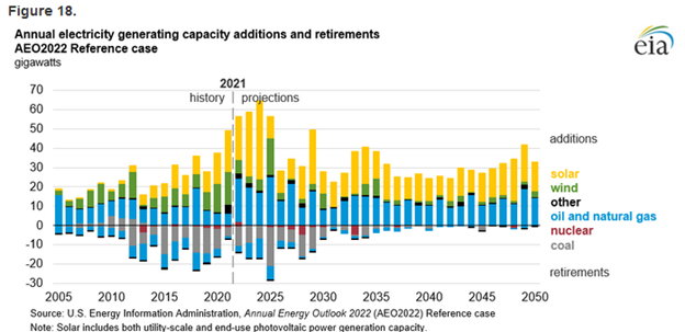
For example, transmission line construction fell from 4,000 miles per year in 2013 to less than 1,000 miles from 2016-2020 to a measly 55 miles in 2023. Capacity additions are anyone’s guess, as demonstrated by the EIA’s forecast in 2015(Figure1) versus actual construction and forecast as of 2021 (Figure2), the latest available guess. Compare the forecast from 2015 through 2020 (Figure 1) to what was built as of 2021 (Figure2). Per my read, the forecast in 2015 was 77 GW of added capacity, and by 2021, the actual additions totaled 204 GW.
Figure 1 2015 Electricity Generation Capacity Additions and Projections
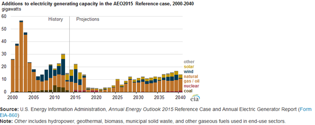 Figure 2 2021 Electricity Generation Capacity Additions and Projections
 Rookies
 Rookies
Back in my report from the MARC a few weeks ago, I wrote that we have a new generation of utility, regulatory, and policymakers who have never experienced managing load growth. As a result, things could get a little choppy. I predict a lot of stretching, tearing, creaking, cracking, and breaking now and then.
Thinking further, today’s load-growth situation is ten times more complicated than it was before 2000 because back then, the solution was easy: build thermal power plants and the infrastructure to transmit and distribute electricity. The chart below shows a massive buildout of baseload hydro, coal, and nuclear power from the 1960s through the 1980s. Those options are no longer politically or socially viable.
Figure 3 Historic Electricity Generation Capacity Additions
 As mentioned in the Mid-America Regulatory Conference by representatives from two technology providers, Schneider Electric and Heimdal Power, “We cannot build our way out of this.” The regulators and utilities will be stretched tight on price and reliability over the next decade—creak, groan, crack, pop, snap, bang, boom, rumble.
Efficiency and Load Management Implications
You might think this is great news for energy efficiency and load management resources. I doubt these capacity-addition constraints will be dire for them, but there are two schools of thought. The first is that efficiency and load management are the lowest-cost resources and should be tapped first. However, the second is that we need to keep rates low and not add efficiency and load management riders to electric tariffs.
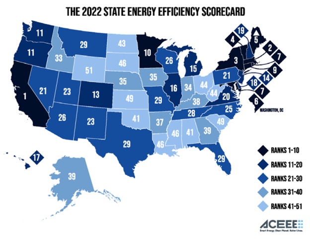
Figure 3 shows the American Council for an Energy Efficient Economy’s state scorecard, which shows which states subscribe to my first theory and which subscribe to the second. I will also add that low-cost resource acquisition is not the only driver for high-ranking states in energy efficiency; decarbonization is another driver.
Figure 4 ACEEE’s 2022 State Scorecard for Energy Efficiency
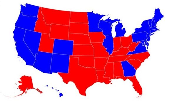
 Come to think of it, the ACEEE map above compares well to the 2020 presidential electoral map in Figure 5 below. Most blue states are near the top of ACEEE’s rankings. Most red states are near the bottom. Most purple states are in the middle: AZ, WI, PA, and NV. The only exceptions are GA (ranked low) and MI (ranked high).
Figure 5 2020 Presidential Electoral Map
Electricity Prices Versus Electricity Sources
 Electricity Prices Versus Electricity Sources
Since we’re looking at maps, I pulled the following two initially posted in Capacity Market Poker. Figure 6 shows the average retail cost of electricity for all sectors. Note that all shades of blue are about the same price, in the range of eight to ten cents. The other half of the colors range from ten cents to twenty cents.
Figure 7 shows the largest source of electricity in each state. Coal is still the predominant source of electricity in the middle of the country, with natural gas providing the plurality or majority of electricity around the periphery and a smattering of nuclear-leading states.
Figure 6 Average Retail Electricity Cost
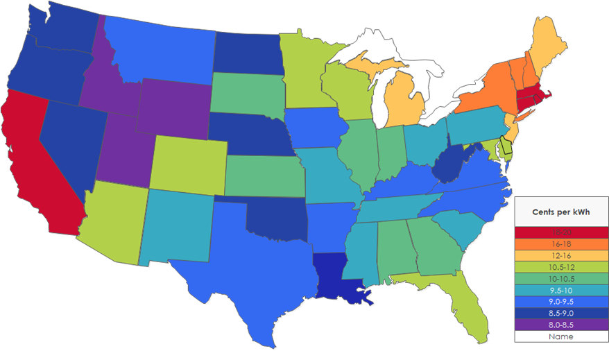 Figure 7 Largest Source of Electricity
 What about renewable energy production? What does that map look like? Figure 8 shows the percentage of renewable electricity production, not counting hydro as renewable. Hydro is very cheap and durable, as demonstrated by its low cost in the three Pacific Northwest states.
Figure 8 Percent of Electricity Supplied by Renewable Sources (not including hydro)
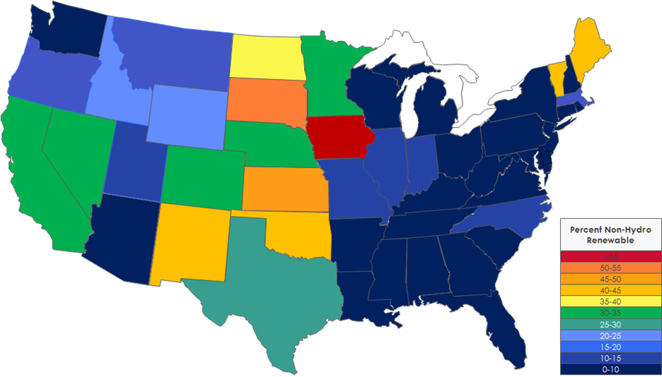 After studying the Figure 8 map of renewable electricity production by state, guess what’s going through Jeff’s brain. Vermont and Maine. What are they doing to achieve 40% renewable energy? Table 1 provides answers. Conclusion: Vermont is tiny – one-fifth of Maine, but Vermont is the first state in the union to have 100% carbon-free electricity. Wow!
Table 1 Vermont and Maine Renewable Electricity
 Believe it or not, I could keep going with more granular emissions data for each state. I will save that for next week.
This section on electricity sources and pricing aims to link electricity sources to price. It boils down to two things in my assessment: 1) access to cheap resources, whether coal, natural gas, hydro, or wind, and 2) policy.
Only seven states get more than half of their electricity from coal: North Dakota, Wyoming, Utah, Missouri, Indiana, Kentucky, and West Virginia. These states all have access to inexpensive coal and some of the cheapest electricity prices in the nation.
In other states, policy drives prices higher. I touched on this last week with the California case. California sits on lots of oil reserves (and probably natural gas) and is adjacent to offshore oil. Similarly, the Northeast has access to the massive Marcellus shale formation, as shown in Figure 9. See how the wells stop at the Pennsylvania/New York border. The nose on your face comes to mind. Hawaii doesn’t have access to any form of inexpensive energy and, therefore, has the highest electricity costs in the country.
Figure 9 Marcellus Hydraulic Fracturing Map
 Next week, we will return to energy efficiency, state-by-state electricity sources and emissions analysis, and quantified reliability.