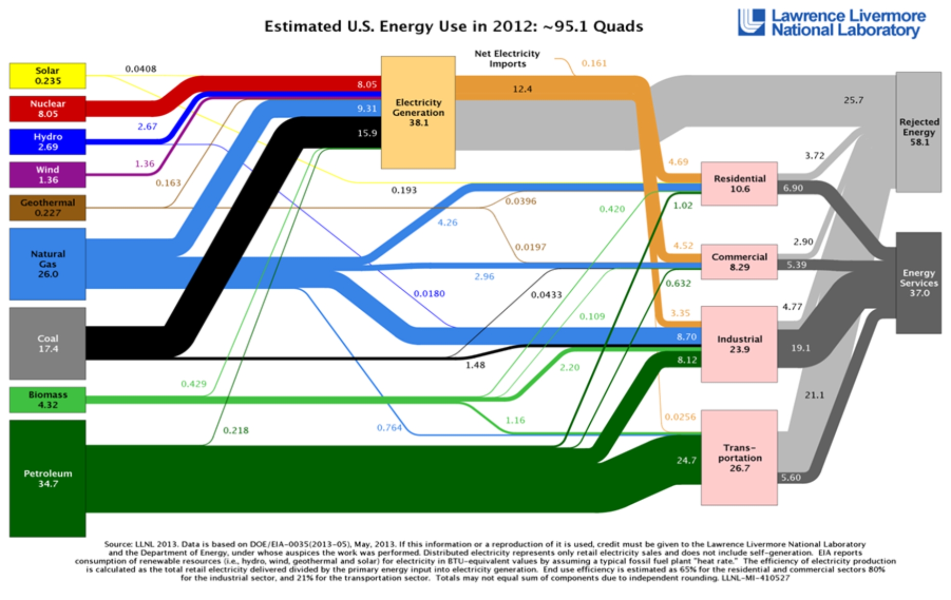
Okay boys and girls; this week features a slice of energy geek heaven spawned by this human/America whapping article from Clean Technica. The basis for the article, and this post, is Lawrence Livermore National Lab’s (LLNL) annual national energy use and efficiency chart to the left.
Clean Technica laments that the country was more efficient in 1970 than it is today. In 1970, the analysis indicates we were slightly more efficient than 50%, but in 2012 we were only 39% efficient. Hold on. This does not tell the entire story. I will demonstrate with a bunch of nerd analysis that we are substantially more efficient than back in 1970 (or thereabouts) when the Cuyahoga River caught fire.
I did my own analysis of the LLNL studies going back to 1950 – skipping 1990 because they have a goofy anomaly or a mistake in the nuclear energy input which suddenly quadrupled to 32 quads[1] and then magically dropped to the modern day input of 8 quads.
My analysis is based on this logic: that non-renewable energy sources are the enemy. This means my analysis considers renewable energy, including hydro, to not be an energy input. This is a minor impact because our non-renewable energy generation is rather tiny. The other thing I do in my analysis is consider electricity production to go straight to energy services. Without source data I cannot tell how LLNL treats this as an output, or “Energy Services”. You can see that in 2012 for residential, 5.28 quads of non-renewable, non-electricity energy is used in residential buildings, and 6.8 quads of useful “Energy Services” come out. Therefore, I conclude LLNL is placing a high value on electricity as an energy input to all facility types: residential, commercial and industrial.
Since I have established that electricity is a high value fuel that mostly passes through as useful “Energy Services”, I consider those losses to be all at the power plant. The non-renewable source fuel has been spent.


First, let’s look at the non-renewable quads of energy input since 1950 (see Chart 1). Clearly the non-renewable consumption of energy has leveled off and is actually declining for most major clumps of energy use, in order: Elec = Electricity generation, C&R = commercial and residential buildings, Indust = industrial buildings, and Transp = all forms of transportation and shipping.
What happened with industrial from 2000 to 2012? I’m just reporting. You decide. Chart 2 attempts to explain, but no conclusions can be made. Obviously, petroleum consumption is far higher in 2012. Does it mean crude oil is considered an input for a refinery? Don’t think so. The US hasn’t built a refinery since 1826.
The useful energy out is as shown in Chart 3. Again, useful energy out is considered to be the electricity produced at power plants, including the tiny sliver of renewable electricity, plus the useful “Energy Services” achieved from each building type and transportation. There is some double dipping because electricity is, to some extent, probably counted twice, but it doesn’t matter. Trends are what we want to examine.
The reason Clean Technica claims the nation is far less efficient today than in 1970 is because electricity and transportation fuel consumption has increased dramatically. You can see on the next chart how, relatively speaking, these broad groups of consumption are not efficient. [Engineers breathe into a brown paper bag to prevent hyperventilation. The reason the buildings are shown to have more than 100% efficiency is because I counted the non-renewable at the power plant and have no idea how to split it out of the “Useful Energy” coming out – so I count it all – a little double dipping, but again – trends, not absolutes.]
The bottom line is buildings and processes have gained substantially in energy efficiency, particularly since the Jimmy Carter energy crisis days – which, gee, is when the energy efficiency kick began!
Efficiency of power generation and transportation has not improved, for a couple reasons. First, power plants are only about 35% efficient and the uninformed, like the federal government, just don’t understand why we blockhead engineers can’t figure out how to improve this. I’ll tell you why: (1) steel and (2) cost effectiveness. The material of choice for power plants is inexpensive steel of various alloys. Steel gets wobbly, weak, and corrosive around 1400F. The difference between temperatures of the heat source and heat sink set the efficiency. Heat sink (rivers, lakes, air) temperatures cannot be changed. Only heat source temperature can be raised to increase efficiency, and that is limited by cheap-steel properties.
Transportation follows the same lines as power generation as far as efficiency limitations are concerned (see Chart 4). I would also add that since the early 1980s, cars have gotten much larger and much more powerful as a result of consumer preference – while maintaining roughly the same efficiency.
The last chart (Chart 5) throws it all together with total non-renewable quad input and useful quad output. Energy use has almost completely leveled off. Efficiency appears to have dropped, but this is misleading because of dramatic increases of relatively inefficient electricity generation and transportation fuel consumption. Back in the day, a much greater percentage of energy was used for “efficient” space heating. Heat is a low-value form of energy and thus the illusion of declining overall efficiency.
[1] Quad = quadrillion Btus – a number so huge it makes our national debt look like a dozen eggs. But just go with it because that is the metric.