Last week, a colleague asked about my take on climate change. This is a wide open question, and my response was babbling and incoherent. Having some time to forge a coherent response, there is nothing in the technological pipeline, nor is there an existence of policy with teeth that will make a significant difference from status quo.
Happy Holidaaaayyyys! Happy Holidaaaayyyys! While the merry bells keep ringing…[1]
Assume the Clean Power Plan (CPP) survives the blizzard of court cases and is successful by the year 2030. Consider the 32% reduction goal of the CPP by 2030. Using round numbers, if we cut total emissions (including transportation) by 30%, it would decrease global emissions by roughly 4.5% if we could do it instantly. Meanwhile, China is increasing CO2 emissions by about this amount every year.
Case closed.
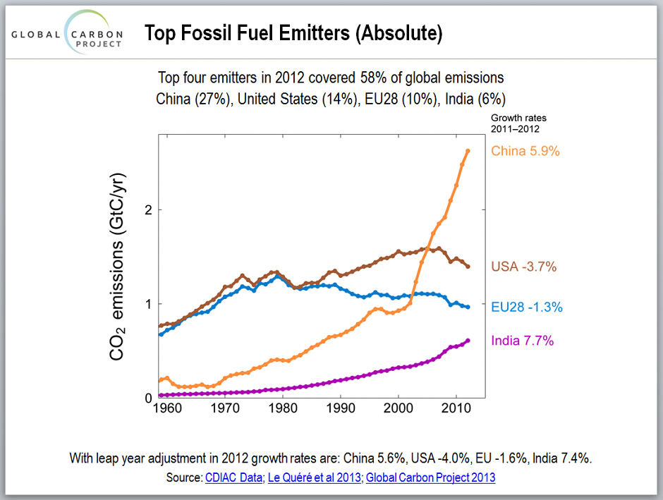
I reported about five years ago in Get a Grip that China passed the U.S. in CO2 emissions back in 2007. Since that time, their appetite for coal has been voracious with an exponential growth rate shown in the chart to the left, courtesy, Global Carbon Project.
This also comes on the heels of an interesting recent article published in the Washington Post. This one provided some great visualization for emission sources by country and how emissions have changed since 1980.
The following charts are taken from the Washington Post article.
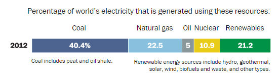
The fuel mix for electricity generation is as follows (to the right). Hydro power makes up the majority of renewable energy.
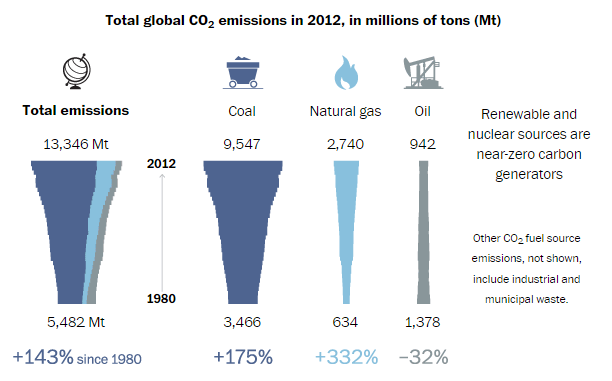
The following graphic (to the left) shows changes in emissions over the last thirty five years, by fuel type, for power generation only. Carbon dioxide emissions from coal have nearly tripled and emissions from natural gas have more than quadrupled during this period.
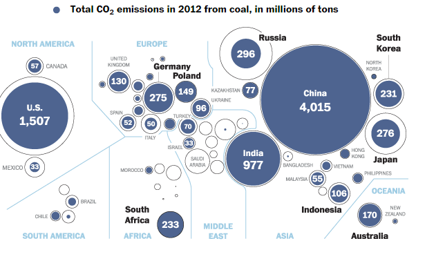
The last chart (Total CO2 Emissions chart below) from the Washington Post Article, that is replicated here, shows the astonishing scale of CO2 emissions, present day. The blue centers represent CO2 emissions from coal power generation. The outer circles represent total power generation CO2 emissions.
Concentric circle charts are most misleading because the area of circles is proportional to diameter squared. So, what appears to be a small difference in diameter is actually substantially greater than the eye and brain can visualize/estimate. Take a guess at the percent shown for the U.S. in blue (coal) below. C’mon do it, just for fun.
Answer, it is only about 75%. It looks more like 90% to me, but that is my eyes playing tricks.
It’s the Conomy, Smarty Pants
Back in Why is Electricity Use Flat? – A Different Look, I explained a significant contributing factor to flat electricity consumption in the US was due to the lousy economy since 2007. At the time of that post, the gap between long term GDP projection (exponential curve) and actual GDP was $2 trillion dollars. The actual GDP was $16 trillion. The gap has since ballooned to about $5 trillion with actual GDP at $16.5 trillion.
We can see from the chart to the right that as U.S. GDP grew in an almost perfect exponential function from 1970 through 2007, emissions were only increasing linearly. The economy was becoming more efficient, particularly with respect to CO2 emissions.
Cue the Chinese growth explosion powered almost exclusively by coal. This flipped CO2 emissions growth from linear to exponential again – like the United States, pre-1970.
Clean Power Plan Bookends are No Accident
The Clean Power Plan would cut CO2 emissions by 32%, with a baseline of 2005, by 2030. Why in 2015 would we choose 2005 as the baseline? Look at the GDP chart, particularly the “mirage”.
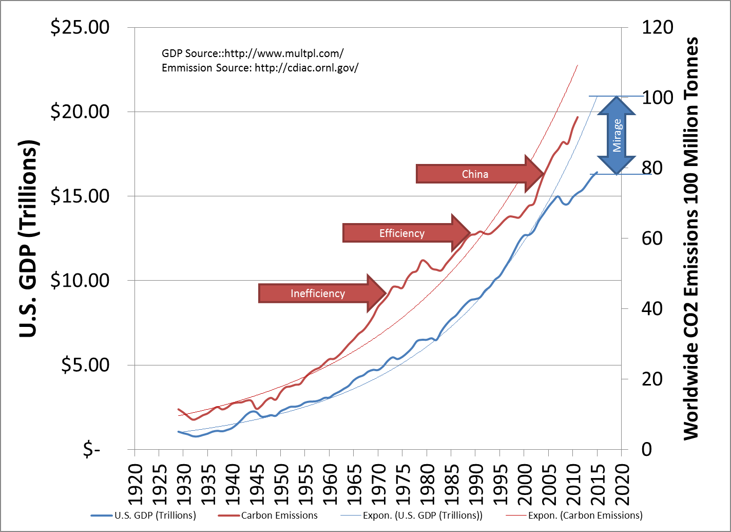
Dating back to 2005 also allows retroactive credit for large-scale wind-power deployment. In addition, the hydraulic fracturing boon has made decommissioning of coal plants in the U.S. rather easy.
The Clean Power Plan is taking credit for achieving half its goal before it has influenced anything.
Summing It Up
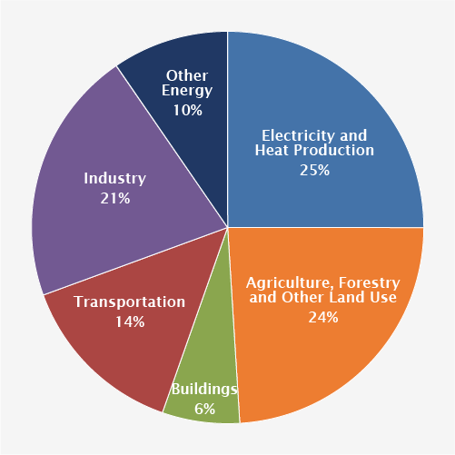
The chart to the left shows worldwide sources of CO2 emissions. The U.S. uses 20% of worldwide electricity production[2]. We have about half the CPP goal remaining. This will “reduce” emissions as follows, roughly:
- 25 of CO2 is from power generation
- 20 of electricity consumption is consumed in the U.S.
- 60 of U.S. electricity consumed comes from fossil sources (roughly 40% coal, 20% natural gas)
- 15 reduction remaining to meet CPP goals by 2030
- Equals: 0.45% reduction in worldwide CO2 reduction by 2030. That my friends gives new meaning to the term, “down in the grass”.
- China and India will wipe out 15 years of our toil with about three months of their fossil fuel consumption increase, all of which will be pumping out CO2 for decades to come.
[1] My mother used to sing this ditty in season – one of her favorites.
[2] https://en.wikipedia.org/wiki/List_of_countries_by_electricity_production