This week I provide my own analysis of raw data to nail this Jell-O to the wall, and I’m done. It’s all good. Does anyone know what the “O” stands for? Orama? Jell Orama?
First a recap from last week from which I got some blowback. But would you believe it if I told you I received substantially more support and backslapping from critics of climate change? As with any highly charged issue, readers/observers tend to attack on a hair trigger anything that challenges established positions and assign you to a broad group of in-duh-viduals to which you do not associate. For example, since I couldn’t stand the Washington Redskins, I must have been a Cowboy, Giant, or Eagle fan. No. I simply could not stand the Redskins when I lived in the suburbs of Gomorra in the early 1990s. That’s all. Period.
Now, consider last week’s message from me:
- The Berkeley Earth Surface Temperature (BEST) team released a report stating the earth’s temperature had increased 0.9C over the past century. I said this is entirely believable.
- I said I have no reason to believe the team doesn’t have geniuses (really) that use the most sophisticated and best analysis methods possible.
- I said, not so directly, that somewhere north of 99% of the population hasn’t a clue how difficult it is to “merely” measure and track the earth’s temperature. It is extremely challenging and an art as much as science, like engineering and energy efficiency is.
First, I set out to take some consolidated data and look at it in a different way, and the results of that analysis, which provides some interesting findings, are provided in the epilogue below.
While reviewing any analysis of ginormous piles of data, I typically say, “Yeah, yeah. Just give me the frickin’ data and I’ll do my own analysis”. So that’s what I did this week.
The United States Historic Climatology Network, the National Oceanic and Atmospheric Association and the National Climate Data Center provide weather station data for thousands of locations throughout the U.S. I think a sample of weather station data should loosely support the 0.9 degree C (1.62F) estimated temperature increase over the past 100 years. So I downloaded four rural stations and four urban stations – two each in the Midwest and California – to test them against the BEST estimate.
The results of these weather stations indicate local temperature increases over the last 125 years, normalized to a century average an increase of just over 2 degrees F – a smidge higher than the BEST estimate for the nation. As a last check I thought, what if CA and the Midwest are freaks in the overall data set, so I added far away Norfolk, VA to the data set. It had more temperature change than the rest at about 3.7 degrees F increase normalized to the last century.
I used monthly average temperatures over these periods and used a linear fit to the data. I thought, well what if there is something weird about using monthly data rather than annual mean data, so I checked that. Hardly any difference as expected.
Urban areas warmed about twice as much as rural areas (2.66F versus 1.23F). Ironically, this was one of the things for which my analysis last week was lambasted. Eat your heart out. Berkeley probably shouldn’t count as an urban area since it is heavily affected by the bay, but there are surprisingly few urban stations available for data. My crude analysis without any hokey dart-board, pin-the-tail-on-the-donkey adjustments for urban heat island effects and other things is consistent with the BEST results. Based on this, I would guess that if I assigned a monkey to do the same thing for the thousands of sites as I did below, the temperature increase in the past century would be reasonably close to the BEST estimate.
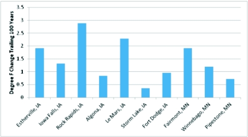
The other thing I picked on last week was the aforementioned pin-the-tail-on-the-donkey “adjustment factors”. I noticed in my two Midwest rural station data that the difference between the two was stark. Surprise! So, I looked at data from a tightly clumped group of stations all located within a 1.5 hour drive of where I grew up (except Iowa Falls, full disclosure). I know these towns. They are dinky and probably average about 5 stoplights apiece. There should be no heat island but there is plenty of possibility for oddities. In fact, I am typically of the opinion when we calibrate energy models against actual weather data, that we should just use the closest weather station because measuring ambient temperature is far more complicated than anyone would imagine. This is because of sensor location and localized phenomena including direct and indirect radiation, adjacent equipment, and whether it is in free air flow in the shade.
Well golly. Just as I said last week, the century-long temperature change amongst them is all over the place. Note, Storm Lake and Le Mars are just down the road from one another and there is almost a 2 degree difference between them. This is what I meant by down in the grass of uncertainty. The estimated temperature change over the century is less than the randomness introduced by measurement “errors”. My case rests. The average normalized increase for these 10 towns was 1.44 degrees, slightly less than the BEST 1.62 estimate.
So Jeff, why bother? Because like many other things, I don’t trust what the talking heads are telling me until I do my own analysis – which granted is crude but consistent with recent findings. People have agendas and my agenda is to convince myself of what is reasonable.
Epilogue
The following was my path toward doing my own crude analysis to test the BEST study. It also delivers some interesting results.
Climatic data, sources, studies and analyses are so vast, you can find a scientific “peer reviewed” study that will tell you whatever you want to hear or whatever you want to believe, on either side. By the way, let me talk about peer review a little. Peer review is supposed to include unbiased critical review of someone else’s work. It is used as a club to beat back opposition to whatever the subject at hand is. However, I would say “peer review” is only a bit more credible than, “It is on the internet, so it must be right.”
Breathe deep. Calm down. Stay with me on this.
Ironically, much of the climatic data and analyses on climate change come from NASA. I was on the sofa with a 103F fever in 1986, the day after dah Bearsss clobbered the Patriots in Super Bowl 20 or somewhere in that neighborhood – BTW, dah Bearsss had a crushing defense and a good quarterback – hated, but good. I watched on live TV the Challenger blow up. Poof. Do you suppose the design of the space shuttle was reviewed, re reviewed, and peer re-re-re-re-re-re-reviewed? I’ll bet so. But yet something as simple as thermal expansion (and contraction) of material was not properly accounted for, causing a catastrophic explosion. There were apparently even warnings from engineers that were ignored. The consequences of this human error and later not addressing it were obvious for everyone to see. An error in the analyses and algorithms to clean and process historic temperature data with miniscule changes on the other hand could survive in perpetuity.
Let me also throw this on the table. I can stand to review something about once, maybe twice, and then I can’t take it anymore. I’m not going to catch an error if it wallops me upside the head, so I get a cold peer review from someone else unfamiliar with the work. Are there any cold peer reviewers left for climatic studies? I couldn’t do it. I’m telling you, it is natural and easy to overlook things when you’ve looked at similar studies a hundred times.
As I mentioned last week in regard to modeling and predicting a reasonable range of outcomes to calibrate an energy model, a modeler needs to have experience and sound methods for cross checks that are relatively simple. In modeling a building for example, you may want to see what the model is doing for a single room – as in, what are the heating and cooling loads, the temperature, the air flow every hour and in what season (heating, cooling, or shoulder months) is it most important to test your hypotheses.
Unfortunately, much creativity and creative thinking went out the window or down the drain with the advent of PCs, spreadsheets, and many other powerful mass-number-crunching applications. For personal example, everyone who went through the nuclear Navy as I did had to take a graduate curriculum in nuclear engineering. In our case, we were to “design” a reactor core – that is, fuel, control rods, poisons and stuff like that for a 15 or 30 year fuel supply, without refueling, that is. The next step was to design a reactor plant to in one way or another maximize ship speed, which boils down to maximizing power to weight ratio while maintaining safety (which the Soviets didn’t so much care about so they had an advantage). Well back in the day of $100 calculators you can now buy for $5.99, engineers had to be creative at optimizing things. As of our turn in the early 1990s, we could turn the PC loose on grinding out thousands of scenarios, brute force. The moral of the story is, the heavy lifting computers provide has displaced a lot of critical thought and gut feel for reasonable results and trouble shooting for that matter.
So given all this I set out to do my own “research” to see what I could find. A billion and a half data points for 40,000 sensors is overwhelming. I’ve reviewed many of nearly incomprehensible climate studies that are all over the place (results wise) with a myopic view of one factor it seems. I looked up some simple data – what are the warmest years on record? If the planet is heating substantially by human release of CO2 it would serve that records would be piled up in the past few years and they would fall in line more or less with time. According to the US Historical Climatology Network, an Oak Ridge National Lab organization, the 25 warmest years in the past century are as shown in the plot below.
Sure enough, there have been many records in recent years, but there are also records clumped about 1940. There are also obviously more record high years around 2000. HOWEVER, the average of the record highs in the 1940s clump is 54.13F and the average of the record highs in the 2000 clump is 54.11F, slightly lower. Note that the latest warmest year on record for the above chart was 2006. I didn’t chop it off there on purpose. That is what was readily available. A couple recent records could raise the average for the 2000s clump, but I would say not by much.
This presentation of credible data indicates forces other than human release of CO2 are at least significant.
I also plotted the warmest average temperatures sorted as shown in the plot below. If somebody in our office gave me results that look like this, I would ask, what’s with the three distinctive step changes, especially the big one from 54.9 to 54.5? There appears to be something “un random” about the data. Figure that out and tell me what you find. Two of those three in the warmest clump are recent and the third was from the 1930s.
The annual USHCN data reflect the above chart with generally warm years about 1940 and 2000 with a cooling trend in the 1960s and 1970s, a period when there was also substantially less volatility in temperature swing from year to year. Why? I have no idea but I’m sure somebody can rationalize it. Also not so ironically, I think it was 1974 when Time, the magazine, produced its infamous front page article that the next ice age was at our doorstep. So much for that apocalyptic forecast.