“Information is the oil of the 21st century, and analytics is the combustion engine.” – Peter Sondergaard, Senior Vice President, Gartner Research[1].

Oil
The explosion of data that is generated on a daily basis is revolutionizing industries across the spectrum, including the energy efficiency industry. Modern control systems can provide readings of thousands of data points on regular intervals, weather data from stations around the world are freely available, and the Internet of Things promises to provide even more data in the future as energy equipment will be outfitted with systems to broadcast data about its performance and its surroundings.
Engines
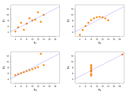
But much like oil sitting dormant in an underground oil field, data isn’t very useful without an analytics engine to process it and produce useful output. As anyone who has had a statistics class well knows, a perfect example of the futility of raw data is Anscombe’s quartet. Each of the four datasets in Anscombe’s quartet has the same statistical properties (e.g. mean, variance, etc.). Only by plotting each of the data sets does one see that each set paints an entirely different picture of the situation (see image to the left):
Images Tell a Story
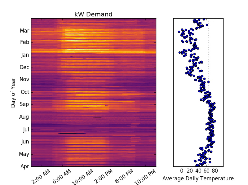
As data sets get extremely large, making heads or tails out of the data requires a visual picture. Someone reviewing a year of kW demand data sampled every fifteen minutes from a school can struggle to parse a 365×96[2] data matrix or can turn it into the graph shown to the right. Coupled with the year’s temperature data, one can easily start to pick out correlations between energy usage and outside temperature.
The Future
As data sets continue to grow, our tools to process the data are constantly getting better. Programming languages, such as R and Python, provide powerful statistical packages to process and plot data, data analytics software such as Tableau or Qlikview provide one off analysis, web libraries such as D3 are making it easy to create dynamic web-based visualizations, and experts such as Edward Tufte and Bret Victor provide guidance on designing better visualizations/data tools. It’s an exciting time in the energy efficiency industry as the growth of data and more sophisticated tools can be used to help customers save more money, save more energy, and move the industry into a new era.

Stay tuned for an upcoming Brief that will discuss data visualization to make stuff happen in commercial and industrial facilities.
[1] http://www.gartner.com/newsroom/id/1824919
[2] There are 96 fifteen-minute intervals in 24 hours


