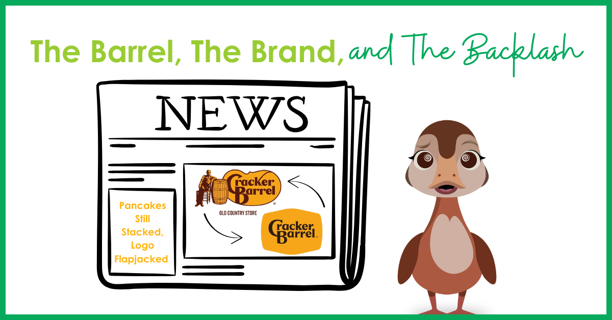
Guest blogger Liz Haworth, VP of Marketing at Michaels Energy
That’s right, Jeff handed me the keys to The Energy Rant this week (what could possibly go wrong?)! Don’t worry – I’m not here to argue about kilowatts, rates, or policies. Instead, I’m wading into a different kind of energy crisis: the storm that kicked up from Cracker Barrel’s new logo rollout – and its whiplash reversal back to the old logo less than a week later.
It may seem like just a restaurant story, but it does tie back to energy, trust, and how companies evolve their identities.
From Barrel to Bare – and Back Again
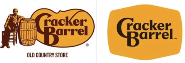 Cracker Barrel recently updated its logo. Gone was the old-timer with his beard, suspenders, and leisurely lean against a barrel – an image that instantly evoked rocking chairs, fluffy stacks of buttermilk pancakes, and a slower pace of life. In its place was a cleaner, modernized design stripped of rustic charm.
And people were not happy.
Shares plunged, customers revolted, and within a week, the company announced it would restore the original design. A $700 million modernization effort quickly turned into an expensive detour.
What’s most striking is not just the backlash but how quickly the company was forced to correct the course. In today’s world, customers hold more power than ever and don’t hesitate to use it.
Brand Identity and Energy Companies: Same Barrel, Different Logo
Energy companies have faced similar crossroads. Think of utilities that rebranded to shed the image of slow-moving monopolies and embrace cleaner, greener futures. Logos turned from metallic blue lightning bolts into gentle leaves, rolling hills, and sunshine. The goal? To signal progress. The result? Sometimes inspiring, sometimes met with skepticism.
The lesson: Logos aren’t just marks – they’re emotional shorthand. Customers make decisions with their hearts and their minds. People don’t love Cracker Barrel because of its typography; they love the nostalgia, the comfort, the memory of road trips with cornbread and country-fried steak. In energy, customers don’t love utilities because of logos either. They love reliability, fair bills, and trusted service. Change the imagery without maintaining that trust, and you risk backlash – or even a hasty reversal.
When Modernization Works – and When It Doesn’t

Brand refreshes are tricky. Michaels Energy, for example, has gone through our own evolution. We started as Michaels Engineering in 1984. As our work grew deeper into the energy space, we realized we were no longer just an engineering firm. Engineering excellence is still at our core, but our purpose and passion expanded to deliver insight, programs, and solutions that save energy and cut waste. That’s when we became Michaels Energy. It wasn’t just a new name; it was a name that matched who we had become.
More recently, we introduced Joules, our new mascot, to give our brand a face – someone (or should I say some-duck?) to explain complex topics with clarity and showcase our personality. Not everyone understood or liked it, but that’s okay. It was a risk worth taking because it stayed true to who we are: approachable, quirky, and committed to tackling energy challenges in smart, practical ways.
That’s a far cry from Cracker Barrel’s new look, which discarded the very thing that made it instantly recognizable. It’s the difference between evolution and abandonment. One keeps the soul of the brand intact while stretching into new territory; the other risks breaking the bond with loyal audiences.
Branding Whiplash: The HBO Lesson
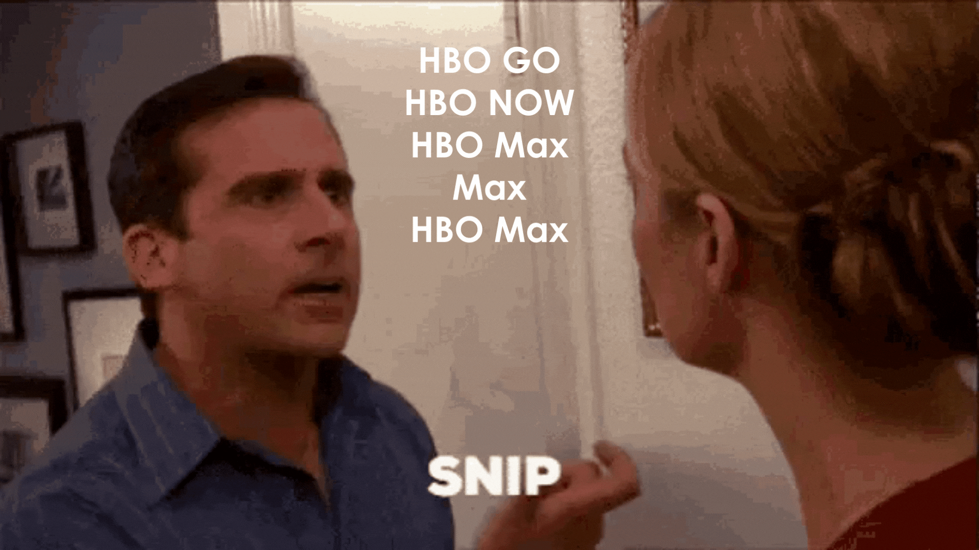
Cracker Barrel isn’t the only one to stumble and backtrack. Remember when Warner Bros. decided to rename HBO Max to just Max? They spent millions trying to convince people to forget the very letters “H-B-O” that carried decades of cultural weight. The result? Confusion, backlash, and eventually, a hasty reversal back to HBO Max. The biggest head-shaker here is that this was the FIFTH name change since 2008. They went from HBO GO to HBO NOW, then HBO Max, Max, and back to HBO Max. Yikes.
The moral? Audiences aren’t dumb. They know when you’re taking away something that mattered. If you’re going to invest millions of dollars in a name change, at least do a few trials with your customers before committing.
The Energy Win: Xcel Energy
Contrast that with Xcel Energy, who in the late 1990s merged Northern States Power and New Century Energies under a new name. Instead of clinging to a long, corporate-sounding mashup, they went with Xcel Energy. It was short, memorable, and forward-looking, signaling momentum and innovation. Importantly, the new identity matched the company’s ambition to lead in clean energy and reliable service. That’s a brand refresh that stuck because it built on trust while looking to the future.
The Consumer Win: Apple
Apple’s logo journey is another masterclass in brand evolution. The rainbow-striped apple of the 1970s reflected the color revolution of early computing. Over time, Apple shifted to sleeker, monochrome designs that matched its identity as a lifestyle tech brand. Customers embraced every step because the logo evolution matched product innovation. They saw the same Apple they loved, just polished for the times.
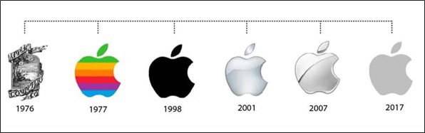
Fun Fact: The very first logo was designed by Steve Jobs and Ronald Wayne and featured Isaac Newton sitting under an apple tree with the words “Newton…a mind forever voyaging through strange seas of thought”. They quickly realized that the complex logo was impractical for a modern tech company, and it was replaced by the iconic, bitten apple designed by Rob Janoff.
The Energy and Branding Takeaway
The energy and branding worlds live in the tension between modernization and authenticity. Change is necessary, but loyalty is fragile.
Whether you’re a restaurant, a streaming giant, a technology icon, or an energy firm – don’t throw out the barrel with the bathwater. Customers will forgive and accept tweaks, polish, and even bold re-imagination – but only if they still recognize the soul of the brand.
Cracker Barrel’s rapid reversal is just the latest reminder: if you abandon your core identity, customers will call you on it. Apple and Xcel Energy proved brand evolution can be done right. At Michaels, we’ve lived the lesson ourselves: evolving our name, our visuals, and even adding a duck to our family – but always in ways that reflect who we are at the core.