Not that my opinion is worth anything, but the results of Chicago’s 2014 commercial building benchmarking report are excellent. The report indicates that most of the 348 buildings that were benchmarked for the study were benchmarked using ENERGY STAR® Portfolio Manager. The cross-cutting data provided reveals interesting facts that are not expounded upon – but I will.
The first thing is rather stunning. The median ENERGY STAR Portfolio Manager score for 348 buildings, accounting for 260 million square feet of building space, was/is 76. By definition, the median score of all buildings in the Portfolio Manager database is 50. The scale is 1 to 100, with 100 having lower energy intensity (high “efficiency”) than virtually all other similar buildings.
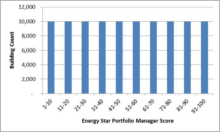
In effect, Portfolio Manager’s building stock, when plotted on a bar chart with the number of buildings being the Y-axis and the Portfolio Manager score on the X-axis, should form a straight line with equal probability of any random building falling into any one of the percentile bins.
For example, consider a huge population of 100,000 buildings that are properly benchmarked with Portfolio Manager. To demonstrate what I mean, I would clump them into bins of scores from 1-10, 11-20, and so on. This distribution would be as shown in the chart.
The following analysis is quite shocking to me.
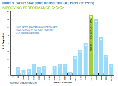
Feast your eyes on the Chicago results in the next chart. It is the same type of plot as my hypothetical one above, with the exception that the bins are in five-point clumps rather than 10 point clumps.
I was unable to quickly verify that the Portfolio Manager score is the same as percentile, except I have two EPA-documented points that close the deal. This ENERGY STAR page indicates a score of 50 means a building ranks in the 50th percentile, with half better and half worse in energy intensity, while this page indicates a score of 75 means the building has lower intensity than 75% of the buildings. This closes the deal. However, I would point out that the second page says “at least” 75%. They are quite elusive in this regard. However, I do have access to older documents that indeed say the score is the same as the percentile as discussed.
This is terribly disturbing to me for a number of reasons.
First, I’m no statistician, although I did take graduate-level statistics when I was in the Navy. A median score of 76 for such a large sample of buildings is statistically impossible. I would expect a median score for such a sample to land between 45 and 55, or maybe 40 and 60, at worst (least precision). A median of 76 has to be at least a couple standard deviations away from the appropriate results. I want to clarify that the energy intensity, as reported for the buildings, seems reasonable. That isn’t the disturbing part. The disturbing part is the Portfolio Manager results.
Second, the distribution shown is clearly a bell curve – a Gaussian distribution. As I indicated above, ENERGY STAR score, by the foggy definition provided, should produce a chart like I developed – with roughly an equal number of buildings falling into each bin.
Third, if ENERGY STAR score is something other than percentile, what is it worth in reality? What does it mean? Why the black box?
This paper was presented at last year’s ACEEE Summer Study for Buildings in Pacific Grove. The author also assumes, as I do, that the score means: “The ENERGY STAR score is an index from 1-100 which is supposed to represent a building’s percentile energy efficiency ranking with respect to similar buildings nationally.” I watched his presentation of the findings and skimmed the paper. He performs wicked statistical analysis of building energy data and Portfolio Manager data and concludes, “My analysis of the ENERGY STAR models for 10 of the 11 conventional building types demonstrates that the scores produced by these models have uncertainties of ±35 points.”
Wow.
I think I just demonstrated in about 1.5 hours of “research” a case as strong as the gruesomely detailed ACEEE paper demonstrated – that EPA has some questions to answer regarding the validity of its ENERGY STAR Portfolio Manager scoring algorithm. It’s looking a little more like a fortune cookie than anything concrete and meaningful.
This could also explain why our benchmarking results of a bunch of hotels show surprisingly loose correlation between energy intensity and Portfolio Manager score.
Somebody has some splainin to do.
A clarification: when plotting building counts against energy intensity, analogous to the above Chicago-building curve for ENERGY STAR scores, I would expect a normal distribution – a bell curve. This has been demonstrated many times. However, this is not how rankings work. Those are straight lines. E.g., the top 25 rankings in college football are not clumped around 9th in the country. We don’t have seven teams ranked 9th in the country, four ranked 8th, and five ranked 10th, with two teams in the top five and one in the bottom 21-25.
According to the Portfolio Manager, Lake Wobegon may not be a fictitious place in Garrison Keillor’s Prairie Home Companion – where all the children are above average. Lake Wobegon may actually be Chicago. Who knew?


Join the discussion 2 Comments